Client: Cheshire Streetwise
Role: UX/UI, Visual Design
Date: August 2021
Their furniture project accepts good quality used homewares and furniture donations to sell in their shop. This app was created as part of a larger rebranding project that I undertook for Cheshire Streetwise in 2021.
As a volunteer run operation, they are often limited by the availability of staff for the store, and were looking for an alternative to opening up in more locations as the overhead would be so high. The Covid pandemic pushed the need for this into more urgent territory, as less people are out and about for shopping, and there are periods where the store cannot open at all.
Implementing a user centric design methodology to create an e-commerce app that allows users to browse, save, and buy items from the Cheshire Streetwise charity shop.
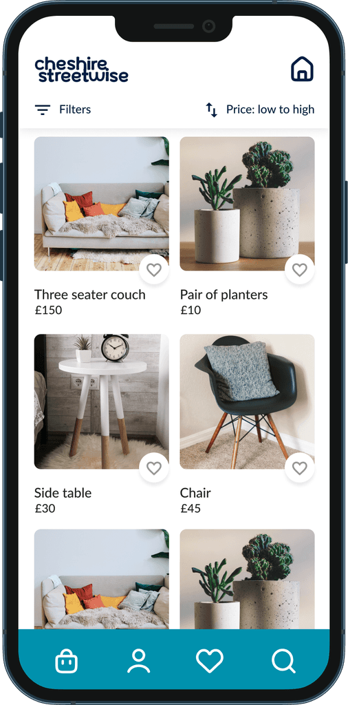
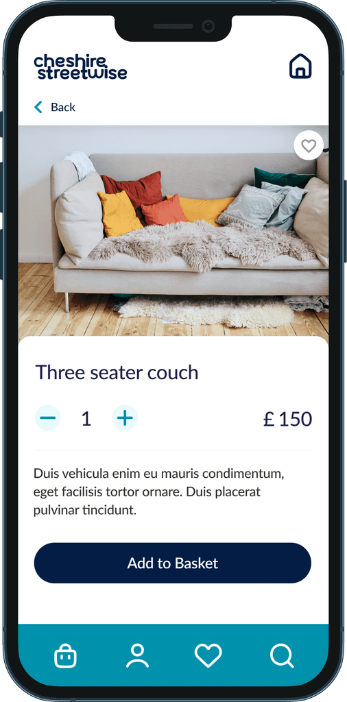
The Cheshire Streetwise Furniture Project is a mobile first app that allows customers to easily browse and purchase items from the charity from the comfort of their own homes. It offers a simple and quick way to get high quality second hand goods, whilst also supporting the local community outreach projects Cheshire Streetwise provide.
We conducted a survey of people living within the Cheshire area to gain insights on their experiences on using the shop, suggestions for improvement of the service, and feedback on why they may have chosen not to shop there in the past.
Several key points came through in this survey that highlighted an opportunity to broaden the customer base and increase revenue for the wider range of outreach projects.
Research Goals
To learn about their shopping habits, what positive and negative experiences they may have had in shopping locally.
To learn what features users would find most valuable in searching for and buying used home goods.
To learn what features users have previously used in apps and which they liked or disliked.
Insights
The store opening hours were a limiting factor, as they depend upon volunteer staff who sometimes aren’t available. This makes it difficult for customers to plan visits.
Some people expressed a desire to buy from the shop but were unable to access it due to work hours or lack of transport.
Most respondents had taken part in some form of online shopping in the past 12 months.
The information gathered through user interviews and surveys helped to identify two main types of customer visiting Streetwise. From this I created two personas so I could refer back to their goals, needs, experiences and behaviours to craft the best solution for them. These two personas consisted of:
Matilda, the 52 year old mum who is community minded and loves to grab a bargain.
Craig, the single 20 year old who has recently moved out on his own and is starting out in life.
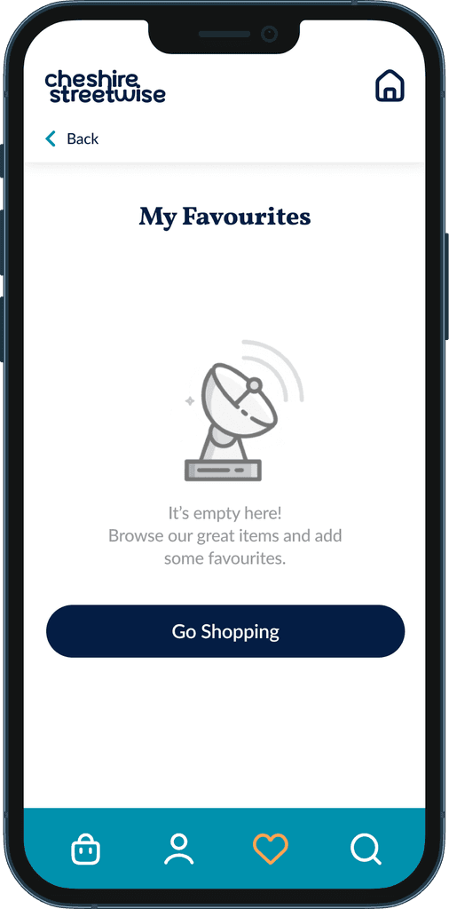
I had identified several of the key features of the app to be the ability to easily browse and favourite items you like for later purchase, and being able to browse and checkout as a guest on the app. I created a user flow for each of these features to start developing the smoothest path for each.
Before entering the user testing stage, I created a series of sketches and wireframes. My sketches were based on the initial user interviews, and user journeys/flows. These helped to refine how the features would come together on screen and to accelerate decision-making through visualisation without losing time, the mid fidelity wireframes were then created in Figma to be used for the user testing.
I came back to the sketches & wireframes throughout the entire design process to make sure that I didn’t lose sight of our primary goals and ideas.
The mid fidelity screens below show the flow for signing up and adding an item to favourites. Try out the prototype here.
Issue 1 : Unable to find a way to get back to the home screen
Evidence: ½ of the participants experienced this issue.
Suggested Change: Add a home icon to the menu
Issue 2 : Underline is too small and hard to find under the button
Evidence: ⅓ of the participants experienced this issue.
Suggested Change: Restyle this to also be a button rather than a link
Issue 3 : Sign up process has no indication of progress
Evidence: ⅔ of participants experienced this issue.
Suggested Change: add a progress/stage indicator to each screen
Issue 4 : Confusion between Sign up and Sign in
Evidence: ½ of the participants experienced this issue.
Suggested Change: Change the copy to read Sign up or Log in
Now that the highest priority usability issues had been resolved, I moved onto rebranding of Streetwise’s visual identity. The new identity was developed to capture their community mission of ‘building up together’. The overall brand shows a friendly face, a helping hand, and a sense of belonging in the wider community. A brand style guide can be seen below for a more detailed breakdown.
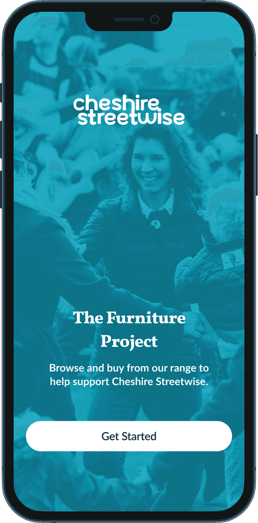
Once this brand was established, I moved on to creating the final screens in Figma. I both integrated and expanded upon the visual language established in the earlier brand work.


